
The Ashmore Creative Design Brand Mark & Colors
Why, yes, it is an “A” for Ashmore. It is my last name. But, like most good design, there’s more going on … if you’ll look a little closer.
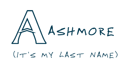
The area within the top of the A hints at the Adobe select tool. As a graphic designer, I spend a good portion of my life within Adobe’s Creative Suite.
(this has been an unpaid advertisement for Adobe)
The negative space inside the mark creates the feel of the tip of a pencil, which represents the writing, messaging, and the strategic thinking I bring to your brand strategy.
The Colors
This palette is blue on purpose .
It’s rooted in a lifetime of North Carolina ties and a long-standing love for UNC Chapel Hill. I spent most of my life in North Carolina with childhood memories of Michael Jordan hitting that shot against Georgetown, and the Heels upsetting the Fab 5 of Michigan for another national championship my senior year of High School.
I think I’ll always consider North Carolina home. All my kids were born there, and those apples didn’t fall far from the UNC fan tree.
The lighter Carolina blues feel open, familiar, and easy to trust, while the deeper blues and darker tones add depth and clarity. It’s a blue that breathes, and is welcoming. And, unlike that ugly blue found in Durham, this one feels warm and balanced, and works great for a brand theme.


So what’s your story?
Let’s have a conversation and see what we can do!